We’re pleased to reveal the final product of a branding project we’ve been working on for a couple months. We’ve said it once and I’m sure we’ll say it again, “Presence is something you exude instantly or never.”
Stacey Tranter artfully crafts bespoke wallpapers and she needed her brand identity to reflect that across the board—from the logo to the packaging and extending into an e-commerce platform as well. As with every project we take on, there was consideration given to the expectations of her existing and potential clientele. The resulting outcome was the following: identity, packaging, and functional advantages over her competitors. Below is a finalized copy of her logo.

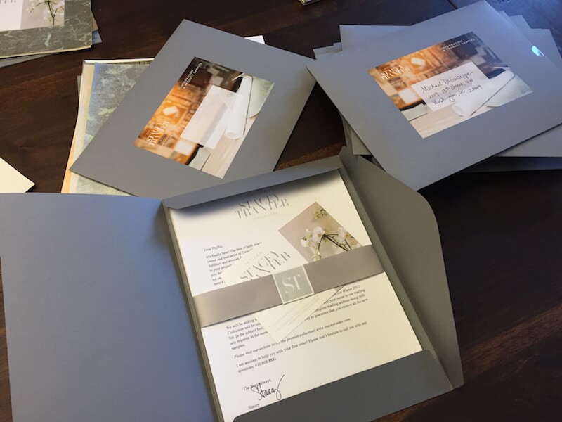
The use of a modified robust serif type for the main part of the logo lent itself to a dramatic and elegant presentation. While the contemporary sans serif type adds balance and readability. After completing the logo, we moved onto the packaging. This involved designing a 4×6″ card, a crest for a sticker, letterhead, and a 5×7″ four color offset printed address sticker. All of which was applied to a custom made petal envelope. We really believe the final product was pretty awesome!

The final piece of this puzzle was building a website that maintained a cohesive look with the now established brand appearance. As with most sites, we built a custom theme using WordPress as the foundation. Adding in e-commerce functionality with some minor tweaks here and there enabled us to give Stacey and her team the competitive edge over her competition.
Stay tuned for more updates and projects.
Cheers,
Tony