Eye On AnnapolisBranding and Logo Development
The Requirements
John Frenaye is no stranger to building brands. He single handedly created one of the most trafficked and award winning local blogs for Anne Arundel County. Like many of our other clients, we were already doing work with John when he approached us about doing a redesign of his logo. He didn’t have any exact ideas or directions for where the design was going to go. He did have some abstract requirements of needing to it represent the area on state, county, and city levels. We went right to brainstorming the things that represent the area the most and piecing the puzzle together.
The Solution
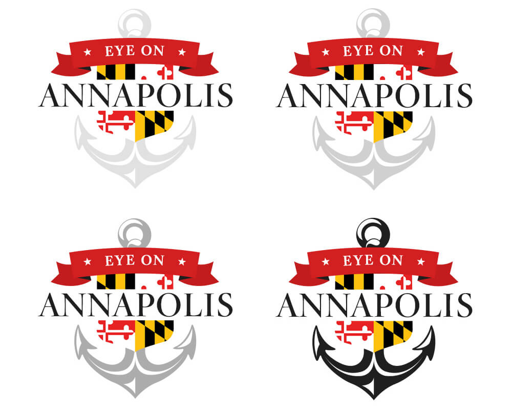
Step one for any project that is heavily design oriented, we kicked this project off with some basic sketches to build a roadmap of where we envisioned the logo evolving to. After nailing down most of the key elements we wanted to have in the design, we brought the design into Illustrator. You can view the first iteration that was sent over to John below. It had a color palette that we felt represented Annapolis well. It became pretty obvious we were close, but needed to think bigger. We then brought ubiquitous Maryland flag into the loop, with the Anne Arundel county crest shape, and changed the color palette over to a Maryland themed logo. You can see the progressive evolution of the design below. This process took a little under a month from start to finish.
